
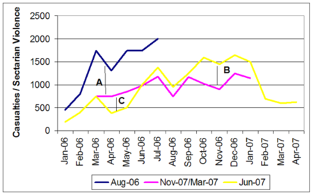

Everyone’s talking about this graph, created by this guy, drawing data from Pentagon reports.
The blue line tracks the level of Iraq violence as indicated in the Pentagon’s August 2006 report. The pink line tracks the level of Iraq violence as indicated in the Pentagon’s November 2006 and March 2007 reports. The yellow line tracks the level of Iraq violence as indicated in the Pentagon’s June 2007 report.
As you can see, each time the Pentagon reports on the levl of violence in Iraq, the numbers change (as indicated by the A, B, and C, on the graph.
And we’re not just seeing random fluctuations — they’re mainly changing downward, in order to reflect lower sectarian violence. But why would the January 2006 be lower in the June report than in the March report? Were the dead resurrected?
You might notice though, that in the June report, killings were revised upward. That’s true. But the timing matters. As Goldberg explains, "The impact here is that it makes the “pre surge” situation look extraordinarily dire and therefore signals progress thereafter."
Lesson: you can’t trust the Pentagon’s numbers. The shell game here has to do with the term "sectarian murders," which the Pentagon is apparently defining differently from month to month, albeit without telling anyone what’s changed.