Fun with maps.
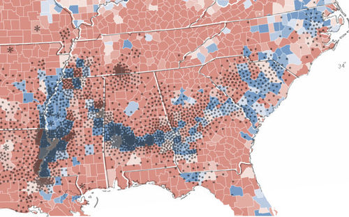
The top map shows the 2008 Presidential results. Blue counties voted for Obama, red ones for McCain (darker hues representing larger majorities).
The bottom map dates from 1860 (i.e. the eve of the Civil War), and indicates where cotton was produced at that time, each dot representing 2,000 bales of the stuff.
Obviously, there's a strong relationship going on. Clearly, not a mere coincidence.
Let's superimpose the two maps, and you'll see the effect is more startling…
So what's going on?
Well, obviously… this has little to do with cotton, and more to do with the African-American population. While there has been much migration to the north of the African-American community, large segments of the community have located not far from their cotton-picking slave ancestors in these communities.
And these communities voted overwhelmingly for Obama.
One interesting outlier was in southern Tennessee in Lawrence County. I'm sure there's an explanation. Perhaps a significant proportion of the black community migrated to nearby Nashville.


